UX / UI Design
Improving digital book browsing
UX Design | Solo Project | 6 weeks


The Challenge
A casestudy based on a hunch I had for a particular book borrowing app, I undertook research and ran user tests to validate my initial thoughts. Once validated, I explored how to improve the experience.
Approach
After mapping out the existing flows for searching for a book on the app, I carried out some desktop research to validate my hunch. Using a combination of competitive analysis and looking through existing user reviews made relatively quick work of this.


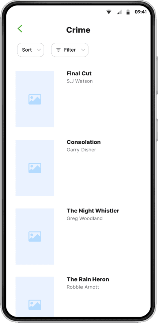
The hunch.
Users might find it difficult to find a book because there is no way to sort or filter titles.

First round of user testing.
I did some usabilty testing with the app as it currently stands. I wanted to understand how users navigate the app and identify any challenges users encounter. I asked users to show me how they typically look for titles, how they would find books in a certain genre, and how they would find books for a specific authour.
Relevance and accuracy of search results
"I don’t know what the organising logic is within genres."
Browsing can be difficult and tedious
"The longer you browse on a screen the more frustrating it becomes"
Lack of sort and filter options hinders users experience
"It would be cool if we could filter this in any way."
Exploring possible solutions.
Sketching out some solutions - both far fetched and more realistic - helped get the ideas flowing. Running these through a desirability / feasability / viability framework helped hone in on what was feasible. The winning option - filter/sort in app - took me back to the start of this process - ideation - to flesh out some options for implementing this feature.

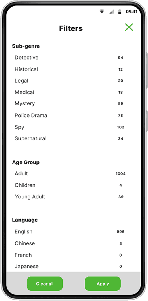
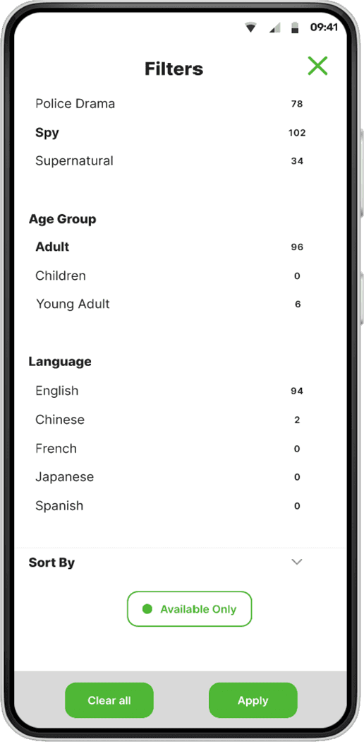
Solution
Having created low-fidelity paper prototypes for two different flows, I could test these with users. I wanted to see how users would navigate the prototype options, how they expected the navigation to work, and to identify the specific sort and filter types that users would like to see.

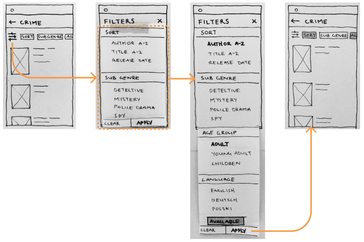
What did the users say?
The users had strong opinions on how sorting and filtering should work, which resulted in solid insights and recommendations to take into the medium-fidelity prototype in figma.
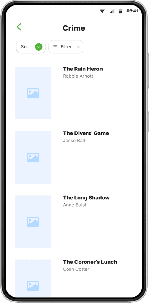
Strong preference for a full screen sort filter option
"This navigation feels really organic, it makes a lot of sense."
All users disliked applying options one at a time
"I hate when it only lets me select one filter at a time."
Desire for a language filter
"l'd love to see language options - I'd get books in Spanish if that was an option."
Outcome
The medium-fidelity prototypes set a strong foundation to be tested again with users ahead of being developed into a hi-fidelity prototype.