Interior Design
Connecting to nature
Interior Design | Joint Venture | 4 years

The Challenge
Designing the interior of Australia's first hospital dedicated solely to cardiac care. With the end user being front of mind throughout, we aimed to create a space that was functional, easy to navigate, and created a sense of ease.
Approach
Drawing on elements of biophilic design, we wanted to connect the interior with the exterior to aid in creating an environment that had a sense of calm and healing, while the spaces had to be functional.

Initial concept moodboard; floorplan showing design intent in early stages of design.
User group meetings.
We ran user group meetings regularly throughout the entire project. The user groups ranged from nurses, to surgeons, to specific departments within the hospital. Each meeting focused on the specific area of each group. These covered design elements such as the layout of a space, to the layout of medical panels. It was important to ensure each room had a flow that optimised the space for the nurses and medical staff to move around with ease. They also covered furniture and fabric selections - making sure pieces were suitable for their use.

Design changes driven by user feedback.
The feedback from the user group meetings drove changes and updates in the designs. We had to be able to quickly model and view these updates as we went before implementing them. This meant me doing quick renders of the updates to review internally.
Changes and additions to the brief along the way.
"We need a security screen to main reception."
AB testing for users.
"Can we see an option with.."
Working closely with the accessibility consultants.
Ensure materials are meeting accessibility requirements.
Wayfinding as second nature.
We worked closely with the wayfinding team to integrate navigational elements throughout the design to ensure users could move around the spaces with ease. Giving each level a unique colour, which was subtly used in elements from the signs, to the flooring and fabric colours, meant users could easily tell if they were on the correct level. We used a repeated graphic pattern at all service points to create a subconcious signal to users.


Communicating visually.
For such a large project, we had to communicate design decisions in a clear, simple manner. Showing pages and pages of floorplans to the client and user was time consuming and confusing, so we came up with visual ways to communicate design intent.

Floorplan showing application of floor finishes, with surrounding finishes for context; pink highlight denoting updates.
Solution
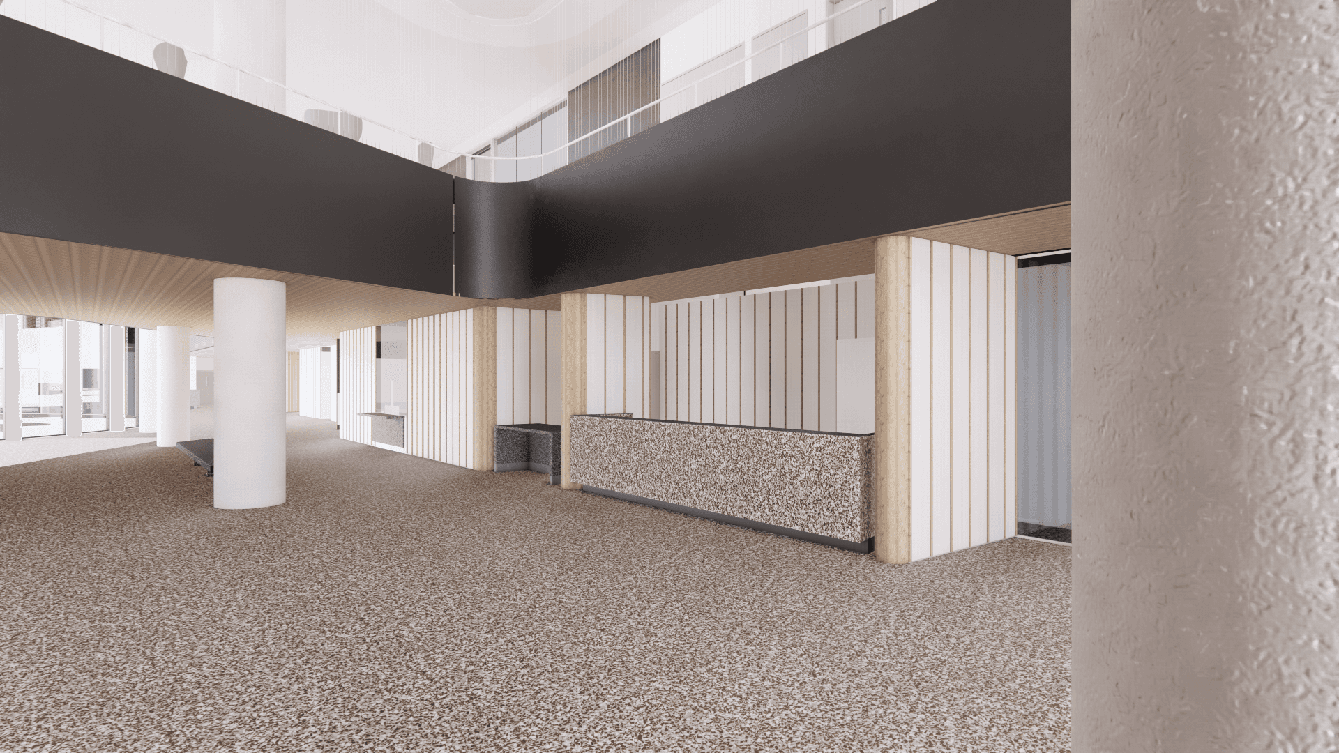
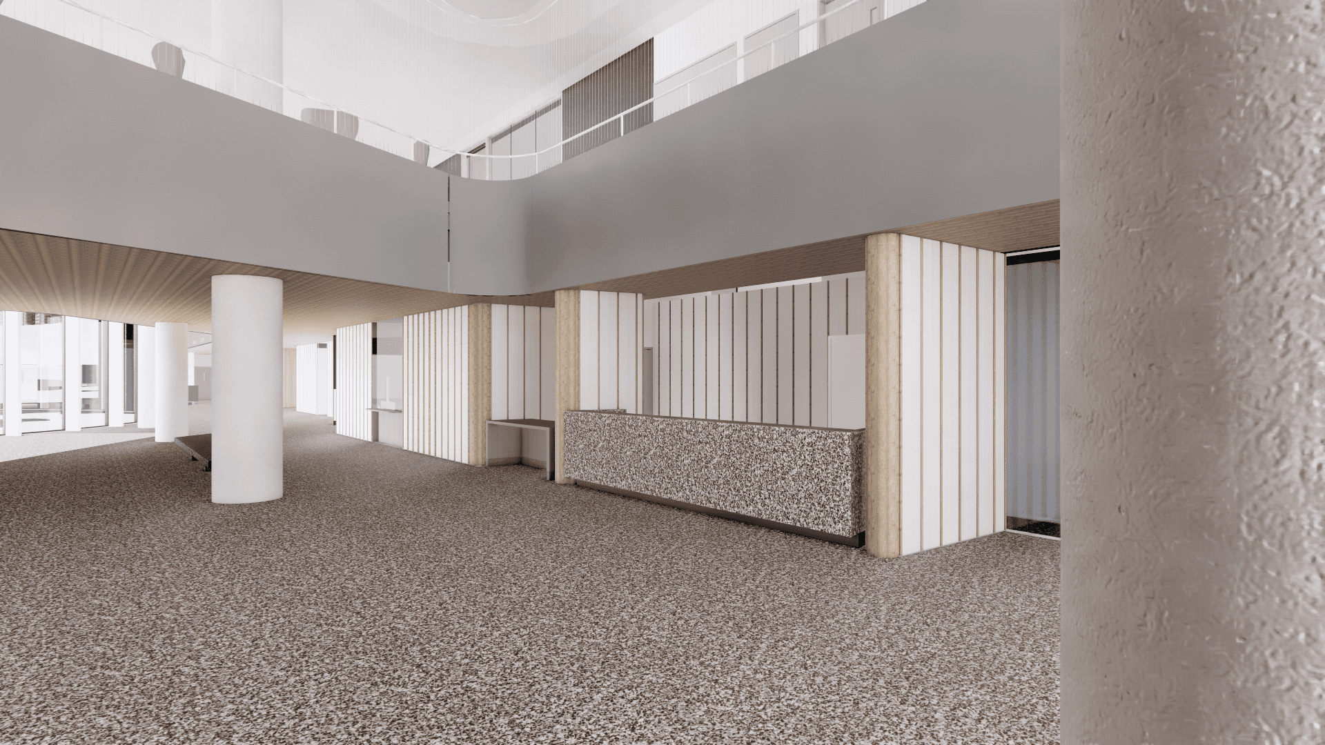
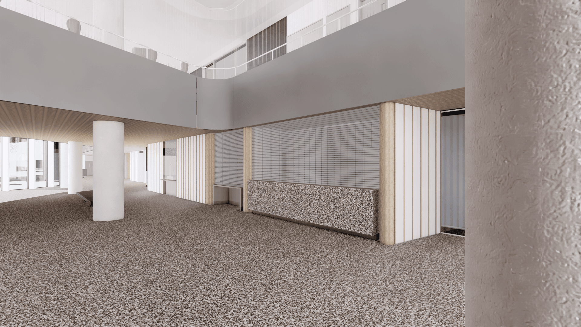
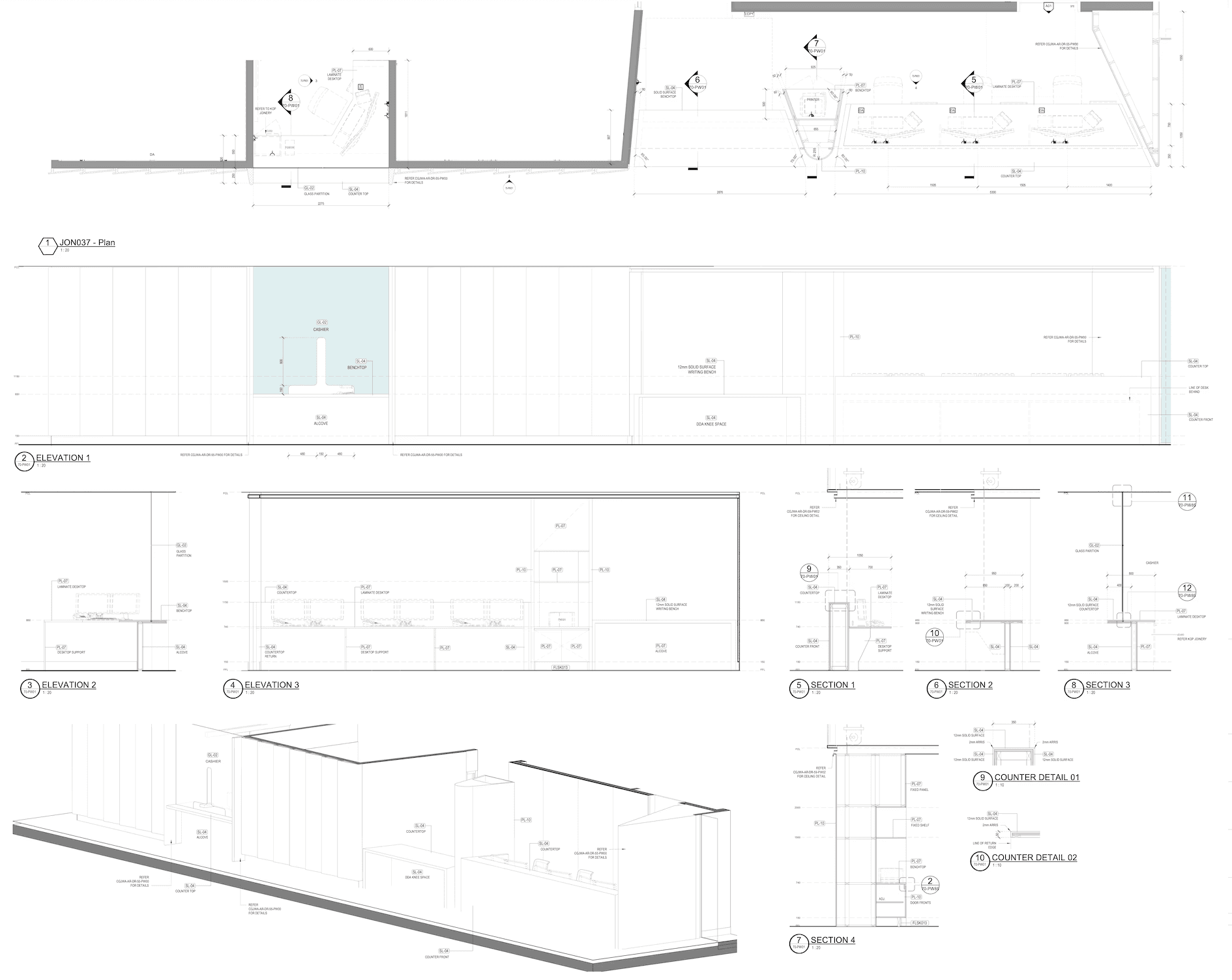
Every decision made during this design process was user driven. Who the user was, varied - from the end user, to the nurses, to visiting surgeons, to people visiting a patient. Details such as the lighting was chosen with users in mind, to ensure no 'flickering' effect while being pushed around in a bed. Reception counters were accessible for varying users, with different bench heights and recesses for wheelchairs. Detailed drawings of all the interiors were developed for the builders and trades, which captured the end result of the design journey.
Outcome
Having pulled colours from the natural local landscape, the interiors subtly reflected nature, while maintaining on overall sense of calm. Wayfinding and the interior fitout worked together to help guide users through the space. The outcome was an award winning, first of its kind hospital for Australia.


